Friday, November 19, 2010

MID TEST DKV ( Desain Komunikasi Visual ) TRACE

Hello guys, long time I haven't post up any of my design again. Well here I have one of my design which is taken from my Mid Test Exam of Computer Graphic. Yeah its not easy as you think but well it costs me a lot of money to present up this project haha. Ok here are the pictures of my Pictures of my Tracing, oh by the way, my class got the theme of a drink called the TIGER BEER. Check it out :

That is the first look after tracing the can and the bottle of TIGER BEER. Still look just normal right? I mean nothing special yet. Within any second I got an idea of the background and the model, because time is running out I have to be quick so I havent give my best shot yet. So here it is my last preview as a poster presented in international paper of A3. And thanks to SNAPY printing too for the expensive printing!


Yep this is my last preview as for my presentation, so guys what do you think? haha sorry if it doesnt looks so great cause this is my first using ADOBE ILLUSTRATOR just as Im on collage haha.
Dont forget your sharpness comment so I can be much better and better.

Thanks guys! Regards the ARAP!

Saturday, August 21, 2010

My Design Portfolio VI ( Light special effect )

LIGHT SPECIAL EFFECT

Welcome back guys, in this post I have already post another of my design project to my portfolio. Maybe you all have heard about picture format as the CompuServe GIF. Yes this format allows the picture move or as called ANIMATED. This is simple and easy if you concentrate on creating it. Let me tell you all the steps.

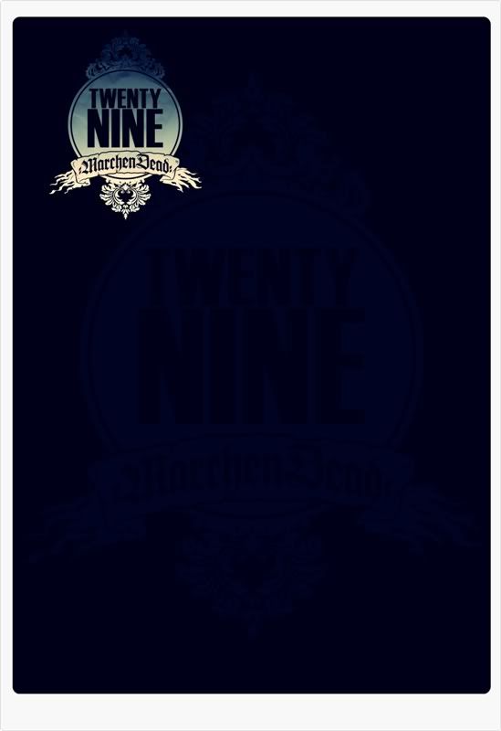
step 1 : The Background
As you all know, background are the most important thing in design. Cause it reflects the story of each design that are presented. And this is how my first look of my project looks like :
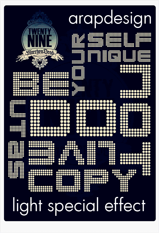
Empty but with a little touch of border and logo of my workshop "Twenty Nine Marchendead"
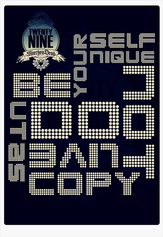
step 2 : Your Idea
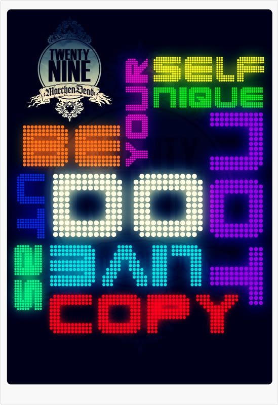
Now the next thing you have to do is to arrange or brainstorm your mind thinking of what will be the best theme to present your project. For me, I have taken the theme of SOCIAL ACTIVITIES where it says "Be yourself unique but do not live as copy" maybe you all understand what I meant. Anyway this is how my idea burns into :
See what im talking about? Neat and Simple. Those words that I've said up there, I turned them into something looks messy but attractive. Cause people will start asking... Oh yeah for your information, making people think and ask will makes your design more to be remembered by them. Still plain no colors just white plain, and type of font that looks polka dot to present a light bulb.

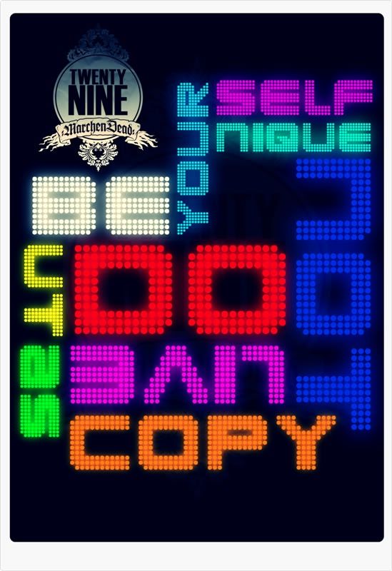
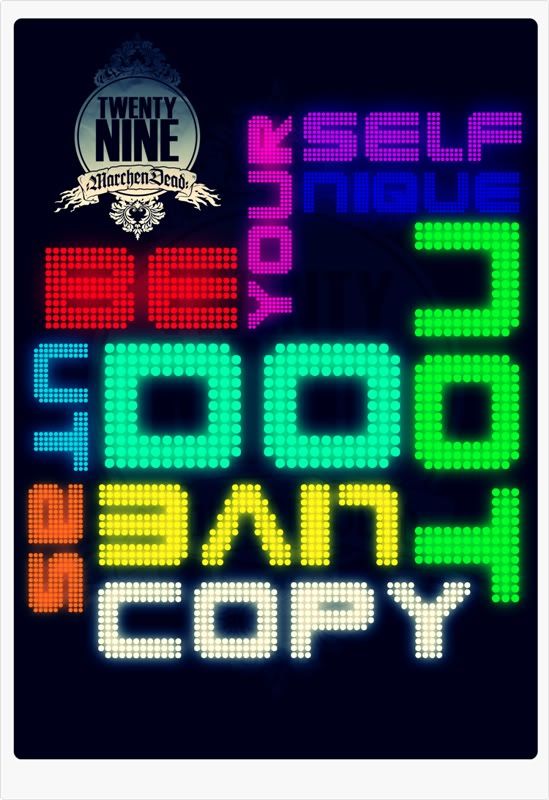
step 3 : The Coloring and Shining
Finally now we are on the last step of the picture, remember THE PICTURE not yet the ANIMATION. I forgot to tell you, that those words on the picture must be separated into Layers don't MERGE it or fit in with one layers. So it will makes you easier to fill up the colors and the glowing stuff. And this is my chosen colors, and I made 3 different colors, see it yourself :
See this 3 different coloring? Its because animation needs many different action in order to makes them moving or changing. But what we are going to use now is Changing mode, not the moving mode. Insyallah the next post will be about Moving Animation. Ok lets move to the animating step.

step 4 : The Animation
As for the last part. All you guys need is to save first of all one by one, then you need to open each file and gather it in one file. Next click on the "windows" then click on "animation" soon it will open a toolbar of animation. There create it step by step by making layers and arranged its time of the picture to change. After you have finish arranging it all, click on "file" then "save as web" when another windows shows up, try to choose "gif" not "png". You will see the difference on the windows after you click on "gif" and change the presets as "GIF 128 Dithered" then click "save" and there you are your project. Oh yes I forgot to show you my Masterpiece, here it is :
What do you all think about this? Not bad isn't? So try it yourself. Thank you for reading and visiting my visual blog. Don't forget to comment and give me suggestion cause your positive words gives me creativity. See you all at the next post.

Thursday, August 19, 2010

PROJECT " VIDEO ANIMATION PROPOSAL "

As you all know that proposals are you usually written down in a paper or as a booklet. Well me and my crew try to make something different and unique with our creative thought. Yes so here it is our special Animated Video Proposal. Which as you all can see that this video includes many of my own PHOTOGRAPHY and DESIGNing portfolio. Well lets just take a look at the video. Oh yes wait a second. We made this so we could advertise our job, like we are now on our projects to make a school Year Book. for those who would like to order you can contact us buy finishing watching this video. So hold on and enjoy guys.

Friday, July 23, 2010

MY DESIGN PORTOFOLIO V ( Colorful But Deadly )

"Monsterous Zombie Cartoon"

This is the 6 mixture of my art works that is combined in one Poster Design which the idea came into my head this afternoon. This poster meant to advertise my artworks, my design and my creativity. And as the theme shall be known as the Colorful But Deadly. Yes, many bright color combined here with a touch of cute colors but instead a little bit of monsterous image would be giving it another meaning of colorful cute design into a colorful monsterous design.

Comment and Suggestion maybe useful for me. Thank you, best regards!


Thursday, July 22, 2010

MY DESIGN PORTOFOLIO IV ( Perplexing Image )

"GRAFFITRIDEE"

Another project of mine using the effect that makes you all having an eye ache.  Well eye ache, new sound of pain I guess. I think it would be a great describe for this design lol. Okey so the theme that i chose for this design "Street Art" or also known as "Graffiti". Why do I chose such a theme? Because for me graffiti is one of the finest art on the street that uses a lot of multicolor to define their moods, story, words or their name on walls or any public furniture. And now I'm trying to combining Digital arts with Graffiti Arts and a touch of perplexing.
This may hurts your eyes if you keep on staring on. Well creativity of destruction I created now buahaha.

Image Preview :

So guys, your comment and suggestion will be so useful for me! And dont forget to follow up my blog. And INDONESIAN creativity wont ever ends!

WARNING!! please as soon as possible use the eye drop to cure your eye from aching and confusing!
THANK YOU !!

Sunday, July 18, 2010

My Design Portofolio III ( POSTER )

THE MODERN ARTS OF TYPOGRAPHY
( THE SENTENCE OF MY LIFE )

Here are the latest project I've been working on. This was so hard cause I have to over do it again and again. But finally I finished this one with my very special theme as my life story line and what lives within me.

This is the preview of my 3rd project : 

This design represent what is within me and everything that is in there will be the forever be mine.
I hope a suggestion and comment will be posted on my post so I could

Friday, July 16, 2010

My Design Portofolio II ( Photography Manipulation )

"THE POLAROID EFFECT PUZZLE ( Me & Her )"

Another of my designing project, here it is my newest . This is created at 14th Juli 2010. With the most ready program like you all known PHOTOSHOP. I used two picture, and that is mine and the girl on the picture which is Charina Dhika Wiedyani. All that is needed for the design to be perfectly in touch is that I wanted for both of our picture to be straight to the camera and smile.
So that is for the picture. And now lets move on to the background. Well this is the hardest part, I must search for a brush that is mostly looks elegant and shows loyalty. And so now for the effect of a polaroid. Creating a box and tried to made it the same as a real polaroid by using shadows and grundges. Then create a lot of copy of the polaroid frame and shattered it around the layers. Finally one by one each of the photos cutting it into squares and paste it on the polaroid frame, and more touches of effect.

Here it is the Final Touch :


Thank you for the visit once more. Please your comment and suggestion would be great for me.

Thursday, July 15, 2010

My Design Portofolio I ( CD Album Cover )

Album Cover ALTERION ALTEVALA
 Hey guys, okey with no bla bla bla here is my First CD Album Design. This is an album cover for my project of school documentation by capturing a lot of our school activity at grade 12 or also known as the last class for school. Yes right the most hard moment cause we are going to leave our beloved friend, remembering how we first met and how we start to grow and supporting each other. But a beginning will always be an ending but not for our memories that we have created together these 3 years. Okey I'm sorry for of the title, well the theme of this Album Cover:
Paper School Elegant!

okey this is the design that I made :
This is the Front Cover ( showing abandoned paper with elegant colorful design )

This is the Back Cover ( the same as the front cover but with a little bit Story of )

This is the Back Cover ( representing our biggest Hard Working "ALSEACE'09" School Festival )

This is the CD Holder and The CD design  ( so simple with only tiles pattern and grundge )

So what do you think guys about my design? I hope this is really work. Keep on supporting and I need ya'll comment or suggestion so I could be more advanced in Designing. Thank you so much. Cheers!

ps: and thanks to a girl who wrote the text for me cause I'm a little bit stupid in Indonesian Language. and once again thanks for you as my inspiration again C.D.W.

Sunday, July 11, 2010

Lost Memories

ME THE FIRST BOY with MOM AND DAD and Keeps on growing and growing until I graduated my Kindergarden School. Thanks to MOM and DAD who had protected me and caring me with your loves! I love ya! Peace out! hehe.

CREATIVE and DETAIL

Guys, check this out. Sometimes people do say that creative is that you can make your own drawing by creating new stuff or renewing stuff to anything that is useful.
Well less of them say so. For example these guys, god when I watched it, it was like Damn for the damnest curse ever! haha. They invert the sentence of CREATIVE. They made creative arts by destroying unused things into a mess but wonderful in eyes. Want to know more? Go ahead click the video below! HURRY UP!

OK Go - This Too Shall Pass - Rube Goldberg Machine version


see how does it all waorks? destroying thing or using unused thing also can provide a CREATIVITY. Arts, are not a non sense. But arts are a sense of willing to make a world more colorful in life.